The Paytomorrow x MetaMartini Application Flow Optimization
What’s the story?
Online lending has its fair share of legal requirements, disclosures and fancy verbiage that can scare away potential customers. We worked with Paytomorrow to simplify their application flow, refine their value propositions all while maintaining the integrity needed to clearly define the accountability of a lending solution for consumers.
How it started
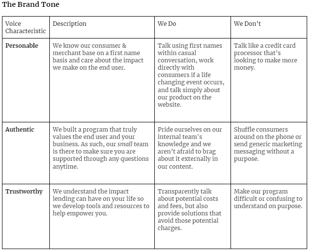
Paytomorrow offers a proprietary hybrid lease-loan-own solution for online consumers looking to confidently purchase everyday products in the near prime space. After reaching an internal capacity constraint, Paytomorrow reached out to MetaMartini to evaluate the branded content and application flow of their financial platform. We started to evaluate how they presented their product both within their site and to their dealer network. Further research was done when MetaMartini worked with Paytomorrow’s top vendors to understand the strengths and opportunities the organization had to scale its support for their growing network. We believe that tone is everything, so our first place to start was to define Paytomorrow’s brand tone.
Fig. 1 - Paytomorrow refined brand tone to outline the remaining workload within the application flow, documentation and landing pages.
How did our work improve their bottom line?
This brand tone would go on to define additional internal resources such as Brand Guidelines, Blog Format Standards, and UI/UX documentation for dealer onboarding. After providing over 25 documented page audits, along with fully revised UI/UX flows for mobile and desktop application, Paytomorrow has utilized the improvements to grow their performance into a younger and more diverse marketplace.
Our control group testing saw a 18% growth in session duration on site, along with a 12% increase click-through on the buttons located on the homepage.
fig. 1 shows a revised copy + illustration to showcase real vendors supporting the Paytomorrow platform.
Simplicity & Transparency
Consumer hesitation reaches its peak during their conversion to lending terms for buying online..and rightfully so. Our changes to the copy, UI and tone of the organization’s online resources allowed a consumer to read and experience a flow that felt simple, clear and human. During the test processes, MetaMartini often added verbiage that assisted in consumers clearly understanding the key components of Paytomorrow’s offering and expected accountability should they choose to move forward. By making the process clearer with additional objective data such as interest impact, “best value” highlights and additional resource material, our control group flow-through rate increased 25%.
fig. 1 shows an updated homepage card that included real numbers for dealers to learn about the performance they could see with a partnership with Paytomorrow.


